
Creating a website is no longer enough to guarantee online success. It’s no longer possible to slap up a few tidbits about your business and expect to get any calls. The design and implementation of different features are crucial to customers landing…and staying on the page. With this in mind, business owners are paying more attention to designer details on their site, tossing aside old and boring templates for new and intriguing features. Here, we’ve picked out six of our favorite design elements that are keeping the attention of the client, and raising the sales for the owners.
Fixed Navigation Bar- This might be the coolest thing to hit the internet since GIFs. When people are scrolling down your page, meandering through your services, the navigation bar for the website scrolls down with them. This allows them to navigate through the rest of the website without having to return to the top of the page. I know what you’re thinking…scrolling is not that difficult. But, on the off chance you haven’t convinced them with your homepage, most people are likely to go back to the browser or exit completely. The scrolling navigation bar provides them an opportunity to explore the rest of the website and get a better idea about your services.
Calls to Action- This one might seem pretty obvious, but it is shocking how many people think that a phone number at the top is enough to drive conversion rates. Having interactive buttons that guide people around has an unbelievably large impact on users. Putting a button under your main information that says “Click Here” is going to get more traction.
Keep Requests Minimal- If you have an online form (which you should) keep the information you request to a minimum. People don’t want to spend twenty minutes on a form requesting information. Name, email, and phone number are pretty reasonable requests. Keeping it simple makes them more likely to take the time and fill it out, which ends up benefitting both of you.
Have an Image Slider- You know you’ve seen a website with these at the top header. Images, captioned with information about the company, slide across a gallery. Rather than just placing one image that loses attention quickly, users can get a visual of different services while getting some background on the product/s.
Color Scheme- Having a coordinating and consistent color scheme is surprisingly important to viewers. The
colors you choose are associated with your company, so make sure you pick ones that you like. There are three main categories of color classification:
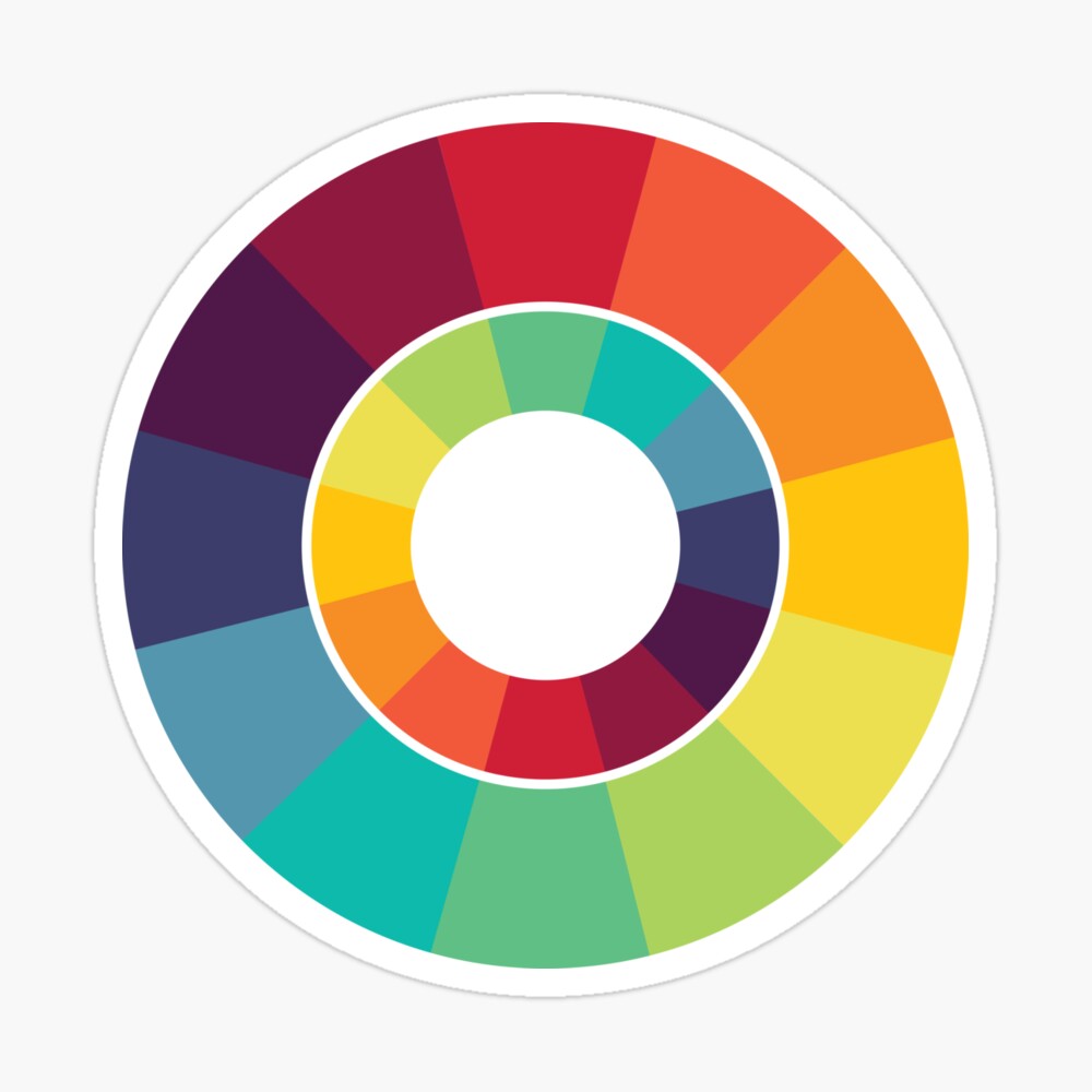
- Analogous: These colors are adjacent to each other on the color wheel, meaning all the colors are similar.
- Complimentary: These are typical across from each other on the color wheel and add a bit more contrast.
- Monochromatic: These are varying shades of the same colors.
All of them work well and are pleasing to the eye…it just depends on your preference.
User-Friendly- The website should be easy to navigate. Having a large number of drop-down menus and excess information can stymie modern readers. Keep the navigation simple and direct, allowing them to find out only enough information to satisfy what services you offer.
